I’ve recently started working as a data science freelancer for voopter.com.br, helping them analyze the data generated by airfare searches on their website. Voopter is a metasearch engine for flights from and to Brazil. The first thing I did was to create an interactive dashboard in R and shiny for some explorative statistics of the millions of seaches performed by users of their website (which has already led to more specific business-driven questions).
The dashboard provides a quick and easy way to filter and aggregate the data, which is stored in an SQL database. The idea is to start with a destination of interest (which could be a specific city or country) and optionally a particular point of departure. For the given destination (or route in the latter case), the dashboard then allows for the selection of a particular date range, and level of aggregation (year, month, weekday etc.) and displays the most useful descriptive statistics. Here are some examples of interesting results.
Overview of origins
The first graph displayed, after having selected a destination of interest, is an overview of the most popular origins from which people intend to depart:

Here I’ve removed the origin names on the y-axis, as the data is proprietary. The origins are ordered by their frequency of searches (right), and are shown along with their overall price distribution (left). The violin plot shows the relative number of returned flights at the given price point, their 25 and 75 percentiles (ends of white horizontal bars), and the median price (red). Several observations can be made already from these distributions. For example, the plot is produces after removal of the top 0.5 percentile of prices. Still, prices exhibit a long tail of expensive flights, very different from the majority of flights. A simple average price for a given route is therefore not very informative (the median shown is more useful). Also, some distributions seem to be bimodal. Though this cannot be deduced from this plot alone, this is due to big differences in fares for flights made around popular holidays and those during low season.
Factors influencing price
Next we can look at the way a fare depends on the time of year, the airline, or how far in advance one is booking. For example, choosing to aggregate by calendar week, the dashboard will produce the following graph:
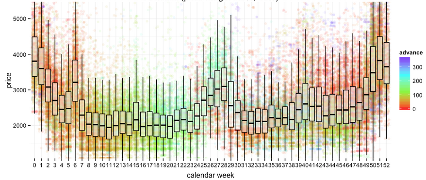
Here, a boxplot summarizes the price distribution for each week, while a background scatter plot shows the actual fares color-coded by the number of days between the booking and departure (“advance”). It is obvious that prices increase around the time of popular holidays, like the summer and christmas. What’s less obvious is the fact that people tend to try and book their christmas flights on relatively short notice, while they seem to plan their summer holidays more in advance (with a probability of overspending on their christmas flights).
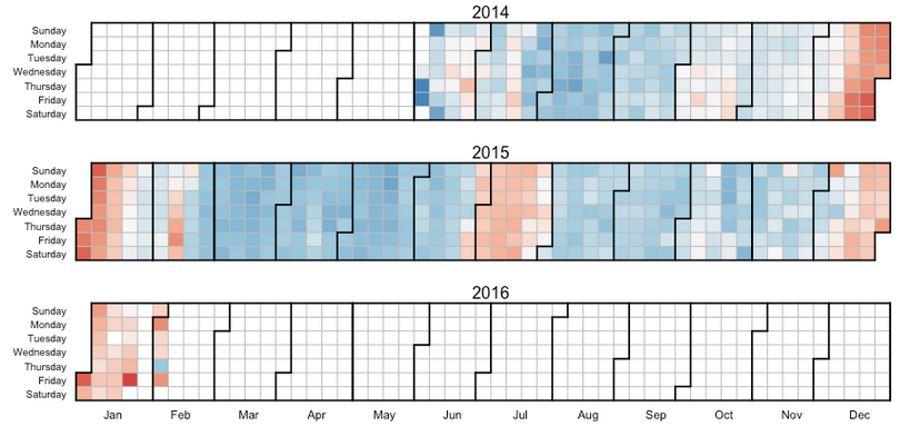
Median prices can also be visualized on a per-day basis in a calendar view, which more easily picks out shorter popular holiday periods, like the carnival in Brazil in February:
The dashboard also creates a boxplot similar to that above to summarize prices for different airlines:
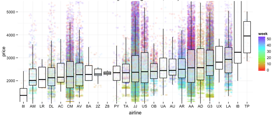
Clearly, savings can be found on average by selecting the cheapest airline. Also, for each airline their most expensive flights are those around christmas and the cheapest those during the weeks before the summer holidays.
Next, what is the best time to book, i.e. how far in advance would it be best to start looking for flights to the selected destination? The following scatter plot shows fare prices as a function of advance and color-coded by the calendar week of departure:
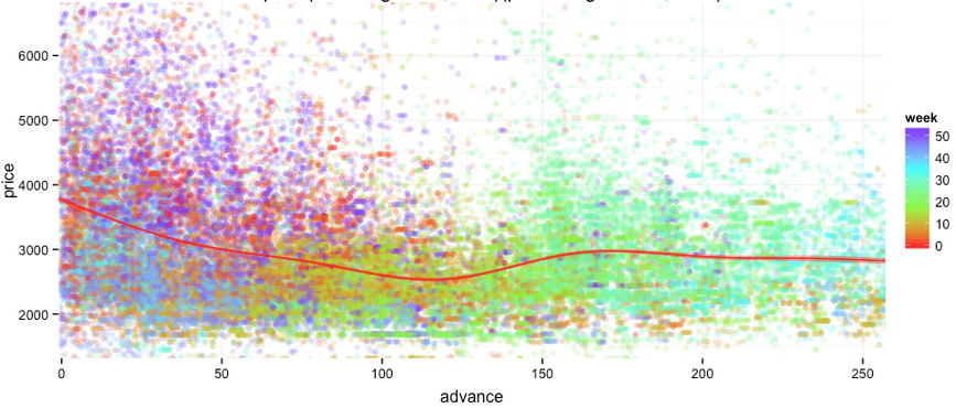
A common pattern, independent of the particular destination (in most cases), is that prices tend to decrease the further in advance a booking is made (see average price indicated by red line). However, the best time to book usually seems to be 3 to 4 months in advance (depending on the destination), after which fares tend to increase again. The plot also illustrates again the curious clustering of christmas flights that are being searched for only a few days or weeks before departure (while cheaper christmas flights, on average, can theoretically be found booking months in advance).
Overall, there are some clear trends describing the distribution of prices for flights to a given destination. These are rather simple to capture in a model, which allows both for the prediction of prices ranges, as well as recommendations as to the best time to fly and book (inference).